My Own Way Back Machine
I was cleaning my backup hard drives today and started to find old projects from college and high school. Amongst the heap I found a file titled "version 1.0". Inside was a website directory so I went ahead and opened index.html. I was instantly transported back to 2005.
Side note: I've put all the sites up on a server so the links on the photo of each site is live. V1's source code is especially interesting to look at seeing as to what it was spit out of...
V1
It all started with my first personal website... And it was built with iWeb.
iWeb was a WYSIWYG website creation tool that was introduced in iLife '06 and lived a long and healthy life until Apple killed it alongside the MobileMe transition to iCloud in 2012. It generated downright awful code in the background but allowed the user to drag and drop elements in a fashion similar to Pages or Numbers. This was at a time where Dreamweaver was the tool of choice that I was being taught how to build HTML with in college. Dreamweaver was still more work (and often awkwardly freaked out when attempting drag and drop interactivity with what you were building). So in stepped iWeb and what I can't believe I'm actually going to share publicly. Again.
It was aptly titled What's Crackalatin?
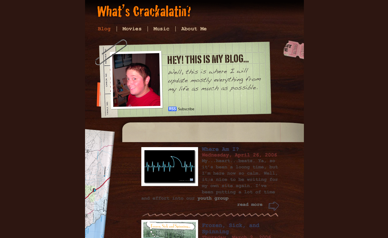
It physically ails me to look at this site today. While it encapsulates me from age 17 to 18 and that brings back some fond memories; the design is like having hot knives pierce my eyeballs. The content isn't any better. I used to treat my blog as a diary that I left open on the internet. Such a bleeding heart of teenage emotion here. You can also check out the mohawk I used to rock that nearly cost me the ability to graduate high school. I'll leave it to you to find that easter egg.
V2
By the time I put V2 together I had about a year of college under my belt. I started college with a focus on networking and communications but quickly found myself confused and bored learning about IP addressing and the binary calculations involved in the process. I wanted color and animations and code! I needed something that would engage me in a way that made college enjoyable so I switched majors to Multimedia Design and Development in between semester one and semseter two. I was learning Flash, HTML 4, CSS and graphic design. It was awesome. I knew that my current site was garbage and I could now build something from scratch by writing my own code. Thus, version two of What's Crackalatin? was born.
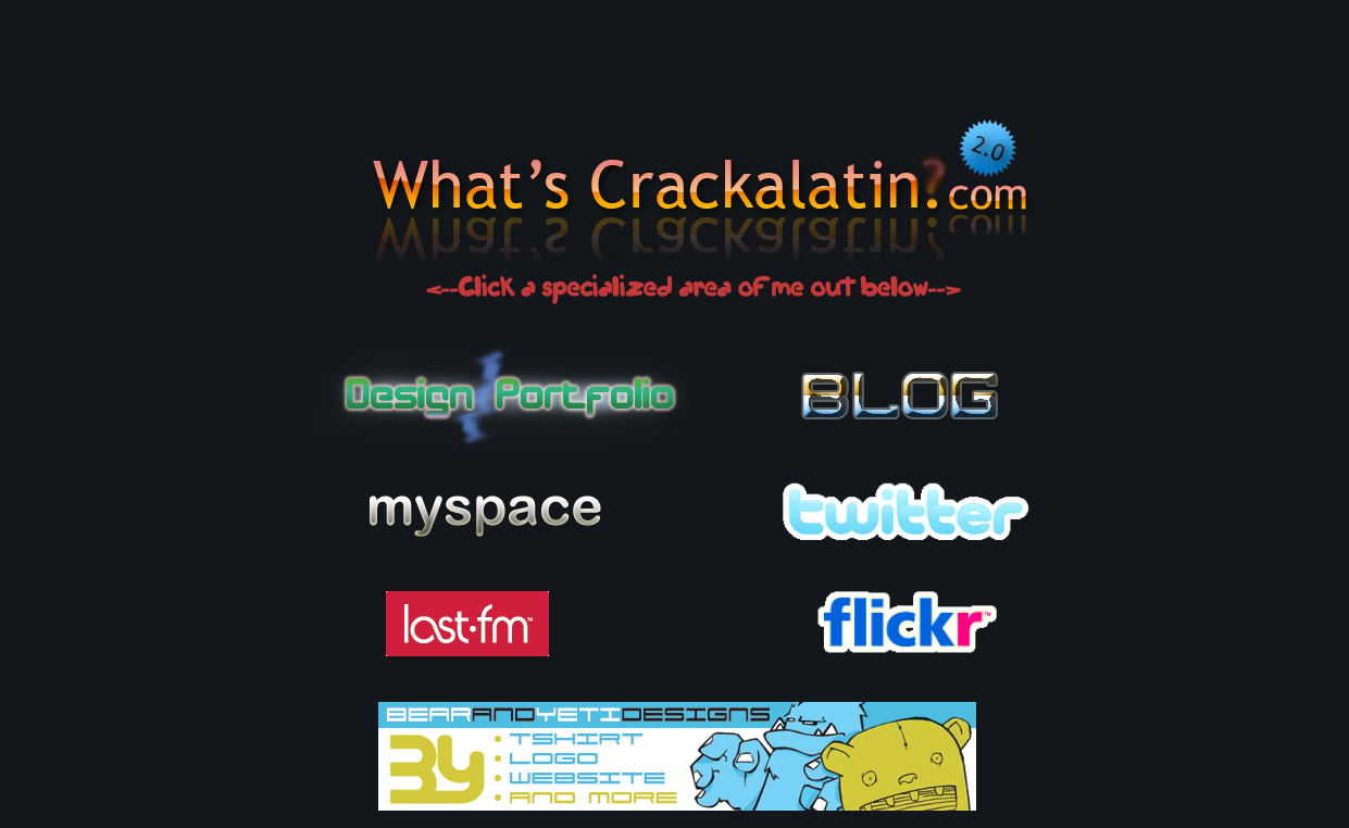
The design is comprised of multiple images acting as links and arranged in a table. There's even a banner for the long defunct Bear and Yeti Designs that my pal Dave Shepherd and I ran for about 2 years while in college. While I have backups of the blogs throughout time, I don't have backups of the WordPress databases so sadly my old blogs that ran on Wordpress are going to stay buried (for the time being). The design on this site is simplistic and painfully scattered. I used to think that every graphic deserved to have it's own font (which is a terrible decision). My portfolio from that time is also linked here and is a kick back to when I was involved with projects such as this awful, awful website that still stands as an example of archaic and terrible design. Every single site I built back then is dead and gone. Huge loss...
V3 (Beta)
Version 2 of my personal site may have lasted the longest of all designs thus far. For roughly four years version 2 represented my personal braaaannnd online. That's just sad. To call what follows here version 3 is really a cop out. It's an image I created with a link to my about.me page. This was the only thing that resided at dabigc.com for nearly a year. Such procrastination.
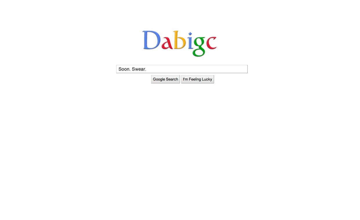
I decided in 2010 to dump the inscrutable What's Crackalatin? slogo (yes, I just said slogo) and just use the "pseudonym" of my most common username online. My new site would live at dabigc.com and would eventually be way better than that junk I'd previously made. I thought that the whole idea of using a pseudonym was slick and that it would get people to search for me by using my psedonym instead of my name. Why? Why would any sane person want to break away from their own name? Because of Cole "The Polar Bear" Konrad. That's why. Searching for Cole Conrad on Google has consistently provided results of this guy and asked if you want to see results for Cole Conrad, like so. I live in the Polar Bear's shadow and used to think that I could circumvent this by using dabigc as my individualization. So many bad decisions. I decided to put up a placeholder site with a tongue-in-cheek nod to the whole thought process above.
V4
When I finally got around to putting version 4 together I was really looking to create what I wanted my about.me page to look like (and they still look about the same as of this writing).
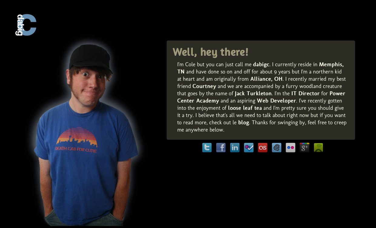
I used a CSS box with rounded corners and the opacity turned down to stuff a blurb about me into. Outside of that I used some social media buttons to link outward to services I used and a jQuery backstretch javascript to ensure that the left aligned background image of me in all my alternative (read: hipster) glory would resize to the window. I felt much better about what I'd built here as my whole intention at this point was to control what people would find if they looked for me online. It was simple and to the point, much like an about.me page and that's all I wanted.
V5
I decided I wanted to start focusing on writing online and having that be the first thing that came up when I started to get the itch to change the website up again. So I began working on version 5 which is what you see currently when navigating to dabigc.com.
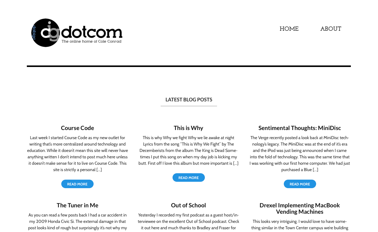
It had been two years that my site had sat silent, looking like an about.me page and I wanted to force myself to start writing more and have that be the focus of what you first saw when to went looking for me online. I thought about building my own theme for Wordpress and the mere idea overwhelmed me. So I took the easy (and much traveled) way out. I visited what I believe to be one of the better Wordpress theme sites out there, WooThemes, to find something that I liked. I landed on Hustle and then created what's currently the logo for the site. The logo has all five letters of dabigc in it with a focus on the "c" since I'm the "c" behind the site. It really has no other aim than to reinforce the site's name but it doesn't make me nauseous like a lot of my older design work. I finalized the site while I was on this trip. I did it all from my iPad mini on the bus ride back from Passion 2013. I still remember Josh Maze asking me what I was doing as it wasn't easy to manipulate the Wordpress backend and an FTP client on a 7.9" touch display.
V6
While version 5 of my site definitely looks the best thus far, the site's naming had long been an awful choice and was honestly only slightly less embarassing than telling people my website resided at whatscrackalatin.com. So I started thinking about writing something that was more focused on what I was immersed in at the time; technology's role in education. Thus version 6 of my site came to be and Course Code was born.
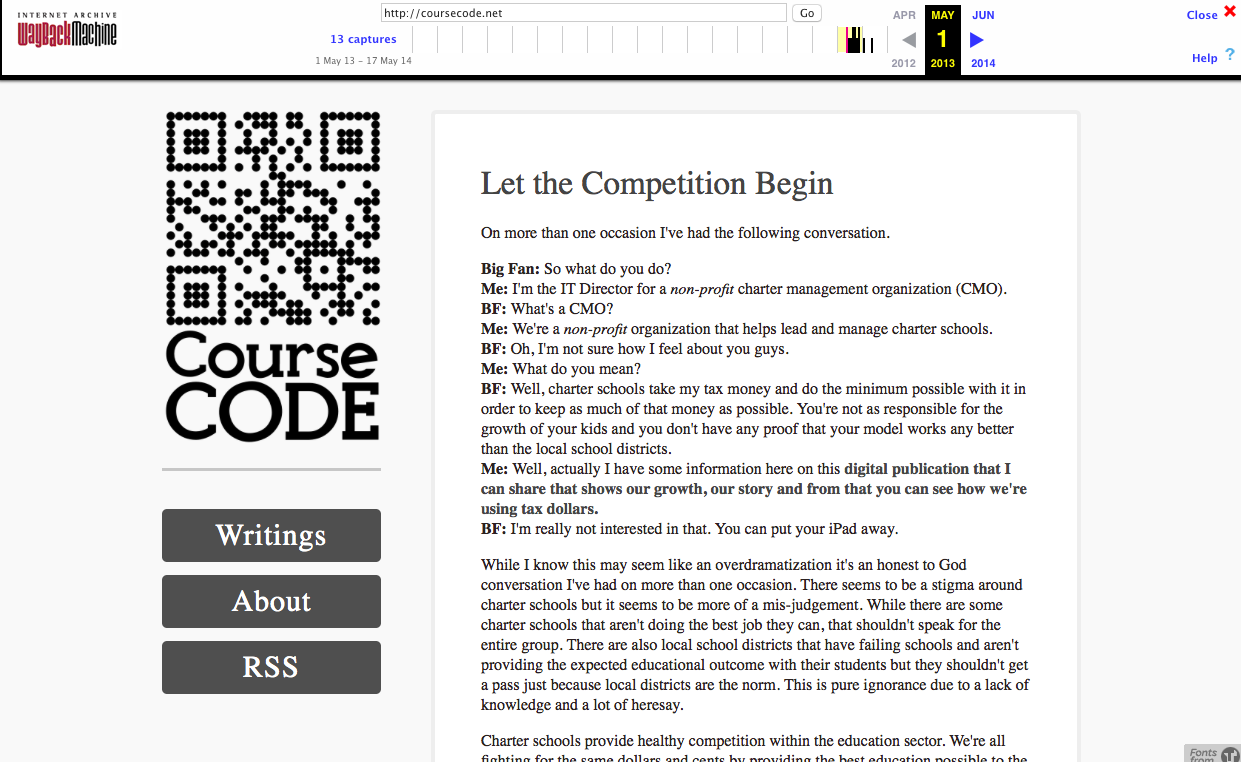
I started going through different names on Hover as it would be pointless to re-brand to a difficult domain name since that was my primary reason for re-branding in the first place. I was blown away when I found coursecode.net was available. It seemed like a mistake that somebody hadn't already grabbed the name but there it was. I jumped all over it. Once I had the domain name I sat on it for a few weeks as I waffled on what the site should look like and if I would stick with Wordpress as the backend for the site. I decided to give Squarespace a try to avoid getting my hands dirty as I knew that I'd get distracted messing around with code if I didn't. My aim was to write. That's it. I wasn't going to screw with the look of the site and end up miles away from my original intent. So I started with the Amelie theme and adjusted it to my liking. I also slapped together what may be the laziest approach to a "logo" that you can create. I made a QR code that pointed to coursecode.net and slapped it above the name in the sidebar. To be fair, I rushed to put the final touches on Course Code a few nights before recording an episode of Out of School with Bradley Chambers. Casper Focus had just been announced and I wanted to write about it before the upcoming recording so I slapped things together in a rush to make that happen. I started to write fairly often and then the inevitable happened. The writing well dried up and I was back to a post here and there. This lead to version 7.
V7
I took the feedback of a few friends and my own self-awareness of how bad the QR Code looked and decided to make Course Code look more like what I wanted it to. Simple, focused on the content and easily readable. I'd had Gabe Weatherhead's post on MacDrifter about his redesign for speed and legibility in my head for months before I touched Course Code's design again and it heavily influenced the approach I've taken with the current look of the site. I'm using pretty large text (20px) and bold Sans-Serif fonts that are easily readable and put the words and images front and center. No sidebars, simple navigation and plenty of posts before you have to click through to the next page of content. Gone is the QR Code (hallelujah!). Instead, the header let's you know that you're reading Course Code and nothing more. I'm content with the look of the site as it stands. We'll see how long that lasts.
The importance of the Internet Archive
Even if it's horrifying when looking back at where my taste and direction were scattered at certain points along the way, the progression I've had since first becoming interested in web design back in high school has been really satisfying. There are fond memories tied to every revision of the site and what prompted me to invest the time I have into the part of my online presence I own. I'm lucky to have found the backups I did but there were pieces that were missing. Luckily I was able to piece them together using archive.org's Way Back Machine. It made me realize the value of what they're doing and how important it is to have an archive of the history of the internet as it ages. When I listened to episode 98 of CMD+Space a few months back I heard Andy Baio talking about the importance of the archive.org's work but I didn't really comprehend it. I'd be truly saddened if I had no way to pull up the work I've put online in the past and share it with my son one day. As the internet continues to become a bigger part of how people represent themselves it will hold more of who they are and eventually who they were. The work that the archive.org team is doing is complicated and has to adapt to the new technologies that are yet to come in order to preserve the full spectrum of what we create online. For those reasons I recommend getting involved or donating to archive.org to help keep the Way Back Machine alive and advancing alongside the market.
I can't believe I've been online with my own space for nearly a decade now. I can't imagine where things will go from here. All I can hope for is that my taste will continue to evolve and that I'll continue to contribute in my own small ways.
